Not only am I really looking forward to the 2012 games but I quite like that logo. Actually, I love that logo.
There, I said it. I'm out and I'm proud.
Since its launch, the logo has been widely and consistently derided. A joke. A national embarrassment. The bete noire of 2012 haters everywhere.
So here's why I think it works. Why it has a fighting chance of being a future classic.

That shape. What is it? (2012 as it happens). Does it really matter?
The great British public were quick to complain that the 2012 logo didn't blatantly visualise either sport, London or Britishness. Helpful feedback suggested the logo should feature Tower Bridge, the Union Jack or other such roaring cliches.
According to that logic, Nike and Adidas should have running shoes as the foundation of their logos. Well, the iconic swoosh and 3-stripes seem to have served those brands rather well.
I realise my own Sunflower logo goes against this argument. I'm certainly not against a literal interpretation. Apple and Penguin books are but two cases in point. However, don't be afraid to approach logos more abstractly.
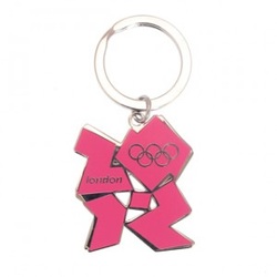
The 2012 logo works (i.e. it stands out, is easily recognisable) everywhere. It works on a postage stamp, a souvenir keyring, website, ticket stub or 50ft high on the side of a stadium.
It works in colour. It works in black and white.
It is easily adapted for use in the paralympic games.

Another popular complaint about the 2012 logo is that it looks like it was drawn by a 5-year-old.
In my opinion drawn by a 5-year-old should be the acid test for any logo.
The Nike swoosh, McDonalds arches and Apple's apple could all be successfully reproduced by a young child.
If a logo takes more than five seconds to doodle on the back of an envelope it is over-complicated. It is trying too hard.
The simpler the logo, the easier it is for the consumer to identify and internalise.
Modern graphic design software allows for amazing levels of depth, shading, 3-D rendering etc. However, if your logo cannot be accurately reproduced with 2-3 Crayola, it's probably time for a rethink.

Much has been made of how one of the key goals of the 2012 games is to inspire a new generation of British athletes. That these games are all about the kids. The 2012 logo is not supposed to appeal to old farts like myself.
Quite rightly, the 2012 logo should resonate more with the Tynchy Strider generation than either mine or my parents.
Picture a bright red circle just to the right of a bright yellow circle…
now think of a credit card…
Priceless?
Great logos can be identified by their core colours alone. McDonalds' red and yellow, Coca-Cola's red and white, Easy Jet's spray-tan orange.
These logos:
a) use a very limited range of colours. Sticking to just 2-3 colours makes it much easier for the consumer to process (can also be cheaper to print/ reproduce)
b) apply these colours consistently, over time, across all marketing communication.
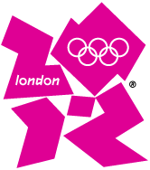
The shocking pink of the 2012 logo is immediately identifiable, unique and can easily be picked out across a vast stadium, a t-shirt or a tiny lapel pin.
Many iconic logos rely squarely on a unique, often bespoke, typeface alone.
Consider Lego, Disney, Google or the BBC: no cute picture, no whizz-bang special effects, just three letters and one typeface. Extremely powerful.
The 2012 typeface takes a back seat on the actual logo. It is consistent with the brand values of youth, freshness and energy. It is also used successfully for headings, etc. across the 2012 marketing communications.

 RSS Feed