
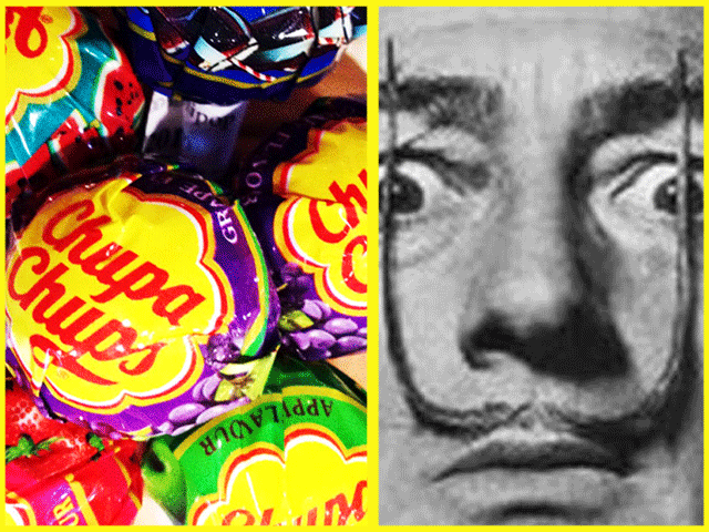
What can Salvador Dali teach us about great logo design? Quite a lot it would seem.
When you think of the great surrealist, you'll probably summon up images of his outlandish moustache, melting clocks, giraffes on fire, or a lobster on a telephone. You are less likely to think of lollipops and daisies.
In 1969 Dali was having coffee with his friend Enric Bernat, the founder of Chupa Chups, the Spanish lollipop manufacturer. Bernat had been making lollipops for just over a decade and was thinking about developing his brand. Dali started to doodle on stray pieces of newspaper and soon came up with the now iconic 8-petaled daisy design.
The logo design has remained unchanged since then and Chupa Chups has gone on to be a truly global brand.
The logo's success is down to the same factors that underpin all truly great logos.
The design is wonderfully simple; a child could easily draw the logo in crayons using just a few basic colours.
The logo is very adaptable too. It performs its job, equally well, online, in print, on a POS display, on the side of a delivery van or, of course, on the top of the world's most successful lollipops. Again, this is due to it's simplicity.
The daisy is unfussy. Often, adding embellishments, a wide colour palette, and special effects (an easy temptation in the Adobe age) will make a logo less immediately recognisable and unique to the brand. Just because something "looks cool" doesn't mean it is the best solution for your brand identity.
As a result, the logo is an immediate, striking, memorable and timeless image. Dali certainly knew a thing or two about creating those.
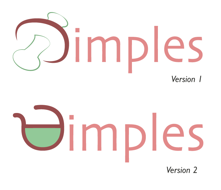
Sunflower's design work will not be in the same league as Dali's. However, I am a firm believer in the power of simplicity–it doesn't always win awards but it does win sales.


 RSS Feed