
One side promoting Sunflower's design service, the other my copywriting service.
If you are looking to place some advertising, whatever the medium, please get in touch.
I look forward to seeing how I can help promote your business.
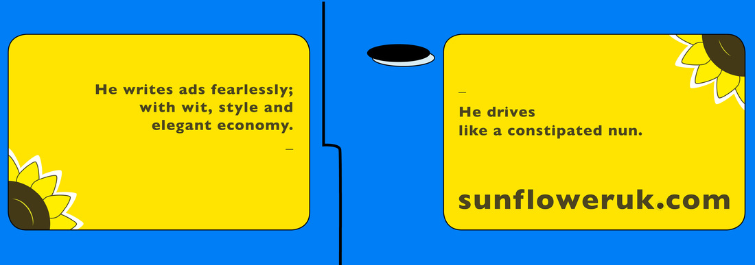
![]() Have just taken delivery of four new car door advertising signs. One side promoting Sunflower's design service, the other my copywriting service. If you are looking to place some advertising, whatever the medium, please get in touch. I look forward to seeing how I can help promote your business.
3 Comments
![]() Hand-drawn & screen printed aesthetic. Made with iMac. Of all the flag-waving hoopla which surrounded the Queen's Diamond Jubilee earlier this year, the thing that amused me the most was the frenzy of brands to cash-in on the event. By cash-in, I of course mean pay tribute to her majesty's 60 glorious years of service. One upside of this blatant marketing onslaught was the special limited-edition packaging which temporarily flooded our supermarket shelves. From teabags to toothpaste, this nostalgia-fest provided a trip down memory lane for some shoppers, and with it a design history lesson as brands re-issued package designs dating back to the coronation. ![]() Iconic posters took a cue from the JFK era. Putting aside the Jubilee completely, I have noticed a trend in recent years for a swing towards vintage design aesthetics in marketing communications and packaging design. This can be seen in Shepard Fairey's Hope posters for Obama's 2008 election campaign, hand-drawn illustrations on gig posters, the popularity of designs by Cath Kidston and Orla Kiely, The Guardian's beautifully simple graphics work and the unstoppable ubiquity of the Keep Calm and Carry On posters. This is largely down to simple nostalgia which never goes out of style. But I think it is more than that.
In a world before the iMac and Adobe, traditional graphic design was done by hand. A designer's tools were pens, paper, transparencies, french curves, Letrasets and stencils. This lo-tech approach inevitably introduced a degree of imperfection. Lines were not perfectly straight. Type wasn't always perfectly aligned. Screenprinted blocks of colour could look uneven and patchy. This imperfection brings an unconscious but powerful level of humanity to any communication. The reader unconsciously knows the (visual/ verbal) communication has come from a human being, rather than from a piece of software or worse, a marketing committee. The communication can seem all the more genuine. More honest. Notice how brands such as Innocent Smoothies, Body Shop and Graze tend to feature a more hand-drawn feel to their visual branding? Their core values are based on back-to-basics simplicity and honesty. There is a heavy irony about modern designers using state-of-the-art digital technology to recreate the glitches and imperfections of the past. And being retro for the sake of being retro gets old quickly. But a designer who uses their modern toolbox with restraint and taste, creates work which connects to customers at a personal human level; that will always be timeless. For design and copywriting created by humans for humans, give Sunflower a call. |
ArticlesWelcome to the Sunflower blog where I discuss marketing communications & design topics and showcase my work. I really welcome any comments/ feedback on these posts, so please feel free to add a comment.
Select from the categories below.
Categories
All
Archives
January 2015
|
Sunflower Marketing Services |
Other Information |
Directory of Harlow Marketing