
| An anniversary? A wedding? Birthday? Putting on a show or club event? If you are planning a special occasion and need some beautifully designed finishing touches – maybe Sunflower can help. Invitations, cards, posters, programmes, tags and place-cards. Or maybe you need a logo or template for your band, club or society? Get in touch if you think I can help. | 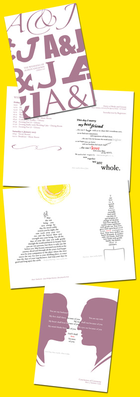 Wedding Order-of-Service. Bespoke design and Illustration. January 2013. |
|
0 Comments
The Joy of LimitationsI recently did a small pro-bono job for my local primary school PTA. A simple tri-fold leaflet. Zero budget. To be reproduced on the school's trusty, black & white photocopier. What would seem to be a very uninspiring brief with tight limitations actually turned out to be a very refreshing project. Tight parameters and limited resources might initially threaten to stifle creativity. Yet often they are the very things to inspire creative thinking. 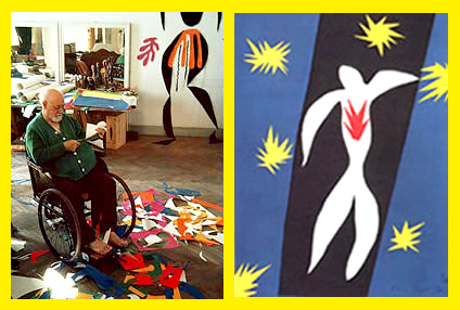
Henri Matisse, 'painting with scissors'.
Henri Matisse created some of his most ground-breaking and influential work towards the end of his life when he was confined to a wheelchair and suffering greatly from arthritis. Finding it difficult to control a paintbrush, he found opportunities to create art in different ways – using cut-out coloured paper shapes in order to 'paint with scissors'. In the early 2000s, the US garage band The White Stripes made some of the most exciting rock music of their generation. Their striking music and image was created through strict, self-imposed limitations – only ever using three elements. Guitar, voice and drums (music) and red, white and black (their image, clothes, album covers and even their instruments). As their singer, Jack White states, "I love limitations, and that's what this band has always been about — limitations and constrictions." Their genre of music, the blues, of course has a rich cultural legacy. All based on very limited and restricted parameters: three chords and five notes. Restrictions, limits, parameters and mandates should be embraced as an advantage not a problem. Restrictions, limits, parameters and mandates should be embraced as an advantage not a problem. They give the creative mind something to fight against. They provide guidelines and take-away some of the decision-making. They allow you to focus on the really important stuff – ideas. Any idea worth its salt should not need a big budget, spot UV finishing or 3D rendering with Dolby surround-sound. These things can enhance an idea, but they are not a substitute for an idea. 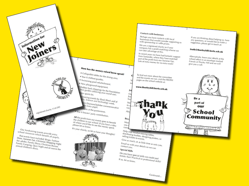
A humble PTA flyer. Black. White. A few simple pen & ink illustrations and one happy designer. Photocopier, do your worst.
Whatever your marketing budget, get in touch with Sunflower for your next campaign.
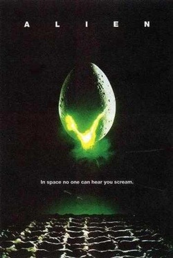 1979. Hainault tube station. A small child stands, mesmerised by a poster. A lime green glow emerges from, what IS that? an egg? Silhouetted against the depths of space. Below it, eight words; In space, no one can hear you scream. Why is this memory still so vivid decades (gulp) later? Why that poster and not the other 20+ on the platform that day? I didn't see the groundbreaking x-rated sci-fi classic until many years later. I couldn't tell you who composed the score or whether it was being shown at the Odeon Gant's Hill. But I can remember the excitement, fear and trepidation that a particular combination of words and pictures had on me. In any communication, how you make your audience feel is everything. Above reason or logic. Above cold, hard facts. Although these are essential too. Consider an awareness poster presenting the fact that one in three people develop some kind of cancer. It certainly makes a very persuasive rational argument. But it is the fear and concern felt by the reader that will really resonate and linger in the memory. It is the emotional response that will inspire them to live more healthily, or make that donation to the cancer charity. 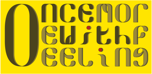 There are many things to consider when putting together marketing material, online or off. Headings, content, design, a call-to-action, materials, timing, brevity, colour and tone. But, in my opinion, at the top of the list should be feeling. Be it fear, amusement, desire, lust, anger, reflection or shock.
 Have just taken delivery of four new car door advertising signs. One side promoting Sunflower's design service, the other my copywriting service. If you are looking to place some advertising, whatever the medium, please get in touch. I look forward to seeing how I can help promote your business. 
 Hand-drawn & screen printed aesthetic. Made with iMac. Of all the flag-waving hoopla which surrounded the Queen's Diamond Jubilee earlier this year, the thing that amused me the most was the frenzy of brands to cash-in on the event. By cash-in, I of course mean pay tribute to her majesty's 60 glorious years of service. One upside of this blatant marketing onslaught was the special limited-edition packaging which temporarily flooded our supermarket shelves. 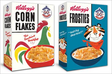 1950s cereal boxes, in 2012. From teabags to toothpaste, this nostalgia-fest provided a trip down memory lane for some shoppers, and with it a design history lesson as brands re-issued package designs dating back to the coronation. 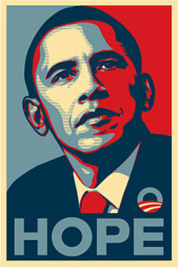 Iconic posters took a cue from the JFK era. Putting aside the Jubilee completely, I have noticed a trend in recent years for a swing towards vintage design aesthetics in marketing communications and packaging design. This can be seen in Shepard Fairey's Hope posters for Obama's 2008 election campaign, hand-drawn illustrations on gig posters, the popularity of designs by Cath Kidston and Orla Kiely, The Guardian's beautifully simple graphics work and the unstoppable ubiquity of the Keep Calm and Carry On posters. This is largely down to simple nostalgia which never goes out of style. But I think it is more than that.
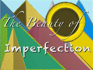
In a world before the iMac and Adobe, traditional graphic design was done by hand. A designer's tools were pens, paper, transparencies, french curves, Letrasets and stencils. This lo-tech approach inevitably introduced a degree of imperfection. Lines were not perfectly straight. Type wasn't always perfectly aligned. Screenprinted blocks of colour could look uneven and patchy. This imperfection brings an unconscious but powerful level of humanity to any communication. The reader unconsciously knows the (visual/ verbal) communication has come from a human being, rather than from a piece of software or worse, a marketing committee. The communication can seem all the more genuine. More honest. Notice how brands such as Innocent Smoothies, Body Shop and Graze tend to feature a more hand-drawn feel to their visual branding? Their core values are based on back-to-basics simplicity and honesty. There is a heavy irony about modern designers using state-of-the-art digital technology to recreate the glitches and imperfections of the past. And being retro for the sake of being retro gets old quickly. But a designer who uses their modern toolbox with restraint and taste, creates work which connects to customers at a personal human level; that will always be timeless. For design and copywriting created by humans for humans, give Sunflower a call. 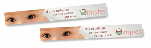 Animated banner advertising design and copywriting. Let Sunflower take care of your online advertising.
Full Copywriting/ creative and design service. Static ads or animated gifs. Get in touch. I'd love to talk about how I could help you with your click-throughs. 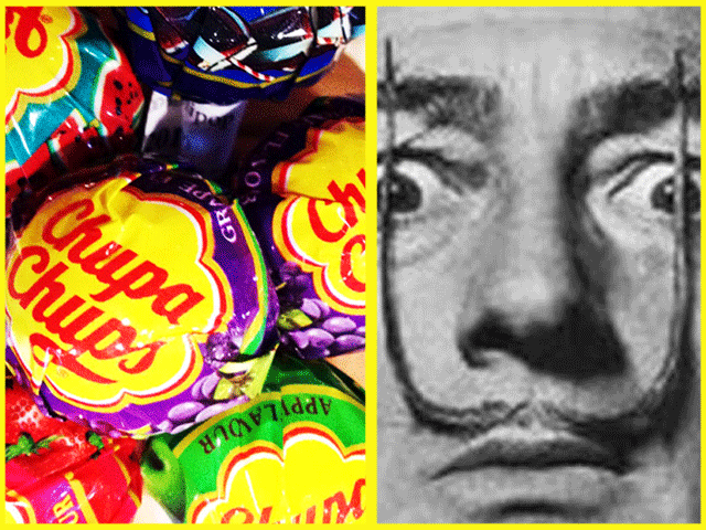
What can Salvador Dali teach us about great logo design? Quite a lot it would seem. When you think of the great surrealist, you'll probably summon up images of his outlandish moustache, melting clocks, giraffes on fire, or a lobster on a telephone. You are less likely to think of lollipops and daisies. In 1969 Dali was having coffee with his friend Enric Bernat, the founder of Chupa Chups, the Spanish lollipop manufacturer. Bernat had been making lollipops for just over a decade and was thinking about developing his brand. Dali started to doodle on stray pieces of newspaper and soon came up with the now iconic 8-petaled daisy design. The logo design has remained unchanged since then and Chupa Chups has gone on to be a truly global brand. The logo's success is down to the same factors that underpin all truly great logos. The design is wonderfully simple; a child could easily draw the logo in crayons using just a few basic colours. The logo is very adaptable too. It performs its job, equally well, online, in print, on a POS display, on the side of a delivery van or, of course, on the top of the world's most successful lollipops. Again, this is due to it's simplicity. The daisy is unfussy. Often, adding embellishments, a wide colour palette, and special effects (an easy temptation in the Adobe age) will make a logo less immediately recognisable and unique to the brand. Just because something "looks cool" doesn't mean it is the best solution for your brand identity. As a result, the logo is an immediate, striking, memorable and timeless image. Dali certainly knew a thing or two about creating those. Sunflower's design work will not be in the same league as Dali's. However, I am a firm believer in the power of simplicity–it doesn't always win awards but it does win sales.
 2-Colour print can look great and save costs. Printed marketing materials have a simple, immediate and tangible quality. They are universally accessible in a way that, so far, their digital alternatives are not.
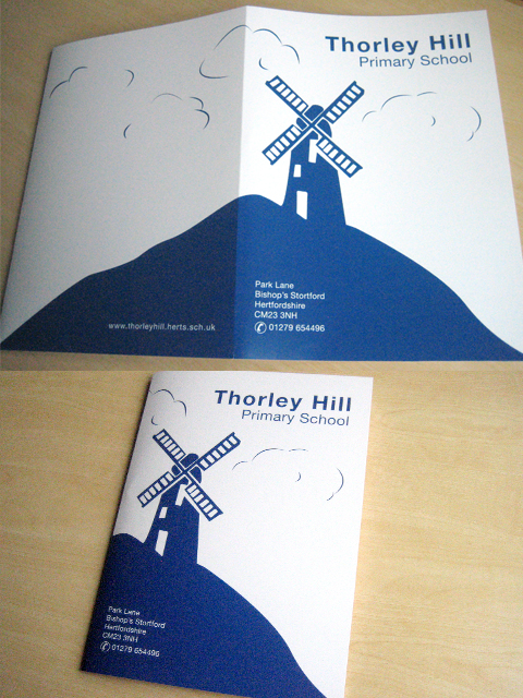
Print is still a powerful marketing medium and is often surprisingly budget-friendly. You may well be able to reduce print costs further if you choose not to print in full-colour. Most full-colour printing involves combining 4 separate inks: cyan, magenta, yellow and black. By just using 1-2 of those colours in your design (e.g. only using black in a black & white only design) you may well make significant savings. I recently designed a prospectus folder for a local primary school. The school colour (navy blue) could be achieved by using cyan and magenta inks only. By sticking to a 2-colour design based on the navy blue and incorporating the school (windmill) emblem I managed to create an appealing design and saved the school 9% on printing costs. Contact Sunflower now for your print and digital marketing design. For one week only. 30% Discount on all Brochure/ Catalogue Design. My promise: The price might be reduced for a short time, but the work will always be 100% focused on making your marketing message clear, consistent, engaging and memorable.
For more information and Ts&Cs, visit the promotions page. Follow me on Twitter to hear about Sunflower's latest offers. 
For one week only. 50% Discount on all Poster and Flyer Design. My promise: The price might be reduced for a short time, but the work will always be 100% focused on making your marketing message clear, consistent, engaging and memorable. For more information and Ts&Cs, visit the promotions page. Follow me on Twitter to hear about Sunflower's latest offers.
|
ArticlesWelcome to the Sunflower blog where I discuss marketing communications & design topics and showcase my work. I really welcome any comments/ feedback on these posts, so please feel free to add a comment.
Select from the categories below.
Categories
All
Archives
January 2015
|
 RSS Feed